Design
This project allowed me to have my first experience with UX tools. I used Adobe XD and learned prototyping and all of the tools that go into designing a user interface on that platform. This allowed me to transfer my skills onto Figma and begin at a head start when contributing to design projects on there.
Podcast Feature
I designed a new feature on the app that allows students to access different podcasts that were posted by organizations at UCSD. This provides a platform for these groups to get attention to their podcasts, while also drawing in students to explore all of the features the app has to offer. This feature would also be scalable to other media services like radio, tv, and other podcast networks at UCSD.
Notifications Screen Redesign
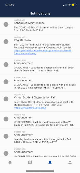
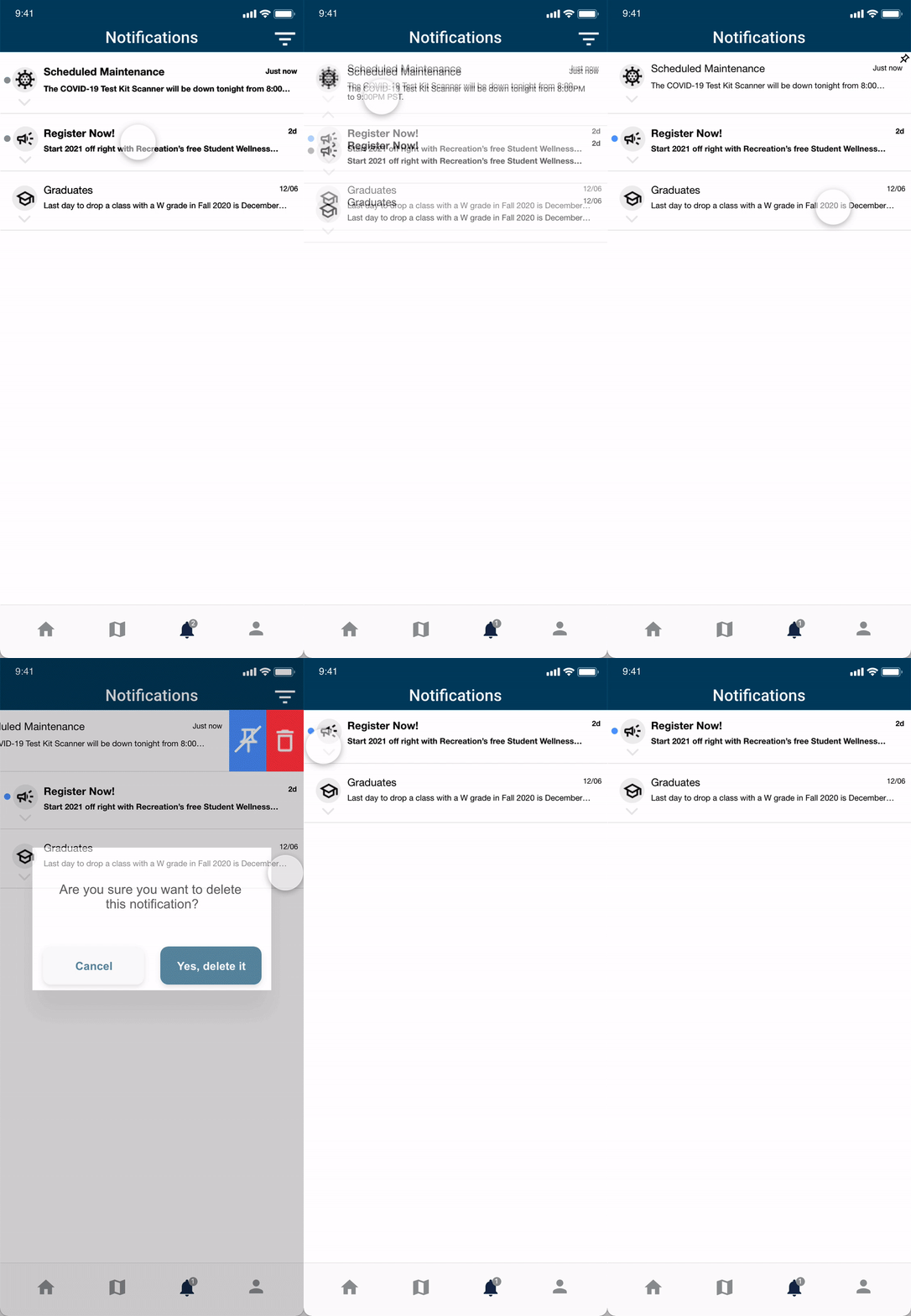
The current notification screen was very bland. It had no interactivity and showed a simple list of notifications in the order that they arrived. The new redesign showcased a new intuitive layout. It featured custom icons for the type of notification, and options to sort and filter notifications. The new Notifications screen redesign adds new interactivity and allows for users to filter, pin, and delete certain notifications. The navigation bar at the bottom also now displays an indicator on the notification bell when there are unread notifications.
Old Screen

New Screen

Campus Mobile Design System
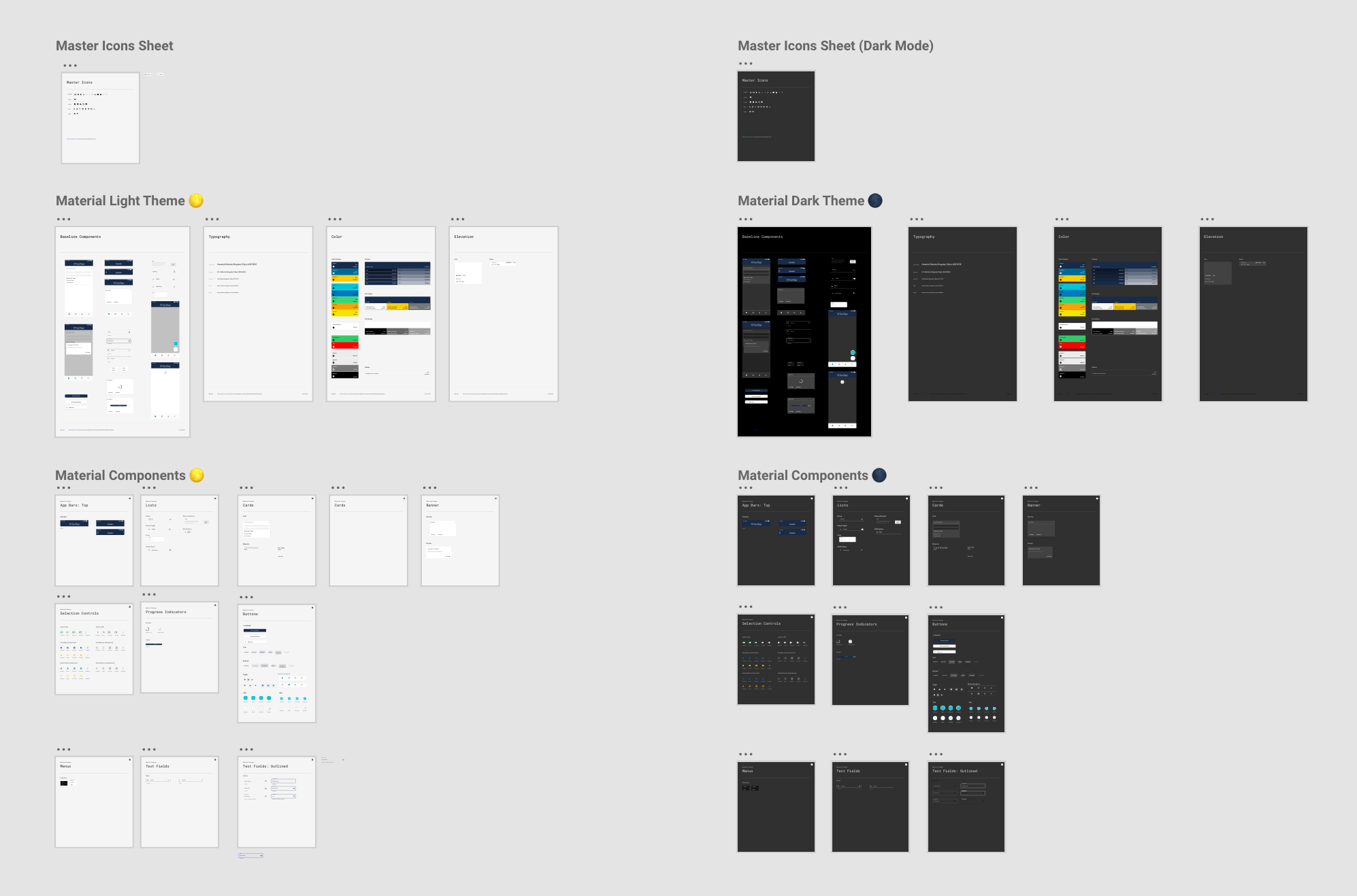
My team worked to create a design system document that standardized typography, color, sizing, spacing, and components of the mobile app. This allowed for faster prototyping, and created a design language anyone can use. We used Google’s Material.io style guides and documented our notes on Confluence.

Home Screen Redesign
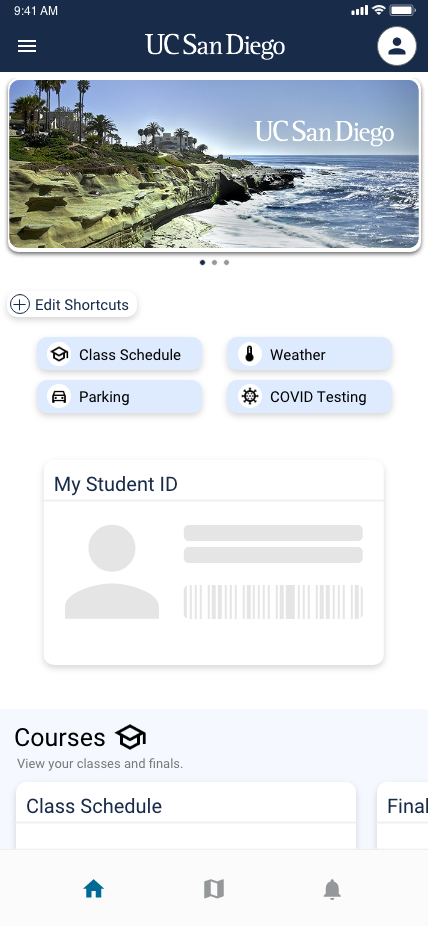
The current home screen features a list of “cards” that each contain one feature of the app. With added features, this list had become too long. We redesigned the home screen to allow for the cards to be categorized and made it easier to access, while keeping it intuitive and aesthetically pleasing.
The current mobile app home screen features a long list of features in a format called a “card” each card has a title and a container which holds the main content of the feature. While this is very simple, the more features that get added means the more scrolling a user has to do.
This redesign improves the card management organization. The cards can be sorted into categories, such as “Courses” which holds the Class Schedule and Finals cards in a horizontal scroll view. Shortcuts can also be assigned. The user also has two additional buttons on the top to aid in navigation.
Old Screen

New Screen


.png)
